Designing for Equity II: The Role of Data in GIS
Data Traps
With thousands of available data sets, it’s easy to fall into a few traps such as analysis paralysis where concern over using the “right” data stalls a meaningful analysis; deficit frame, where only negative data is mapped; and performative analysis where data is mapped without the intention or capacity for it to influence design decisions.
The biggest trap is centering buildings over people. To go beyond GIS as a record keeper of physical features – its historic role in the design industry – we must consider not just the built environment but the people who inhabit it. So how can designers and planners select the most relevant data to visualize and analyze in GIS? Since every community is different, there is no one size fits all collection of data sets that could reliably measure spatial equity across every building or project site. However, there is a common framework that can be applied anywhere.
A Framework for Data Selection
The Social Determinants of Health, initially developed by the World Health Organization, are a framework of six categories including community and social context, economic stability, education, food, healthcare, and neighborhood and physical environment. Within these universal categories, we align specific data sets with people’s experience of their community. What does that look like?
Let’s use transit as one example. We can use GIS to see whether families have access to cars, how far a given population travels to get to work, and whether public transportation reaches a neighborhood. But by talking to people in that community, we might learn that a certain population feels unsafe taking public transit, making transit’s quantitative availability less relevant. Along the same lines, consider transit as a function of access to cultural resources. In some more suburban communities, public transportation isn’t prevalent and parking is plentiful, so car ownership is a more relevant data set to measure access. In other urban communities, parking is tricky and public transit is ubiquitous, so data on proximity to transit stops aligns with that community’s experience of access. Talking to people helps us understand the nuances of how their environment is experienced, which informs the selection of meaningful data sets that answer important design questions. Explore the chart below to find out what types of equity-oriented questions the Social Determinants of Health categories and related data sets can help to answer:
Findings Confidence and Data Reliability
By looking at a diverse range of data across these categories, we can begin to understand the unique aspects of a place: the potential assets, areas for improvement, and opportunities. As we covered in part one, “A Guide to GIS Principles“, GIS helps us overlay datasets to understand intersections. This ability to overlay and compare related datasets helps increase confidence in our findings. For example, on a project in Boston, our goal was to understand which neighborhoods were historically disenfranchised. When we looked at over 30 data sets in three different indices measuring race, language, disability, and economic status, we saw that they all pointed to the same neighborhoods. Inequities are so intrinsic to our urban environments we often find that different datasets point to the same story.
Quality insights start with vetted, validated data sets. In addition to confirmed open-source datasets, several tools give us access to and visualize reliable spatial, statistical, and temporal datasets, providing richer insights to our clients and communities:
- ArcGIS Pro and ArcGIS Online are our primary platforms for analyzing and sharing GIS data.
- ESRI’s Living Atlas provides a variety of curated datasets about populations, physical features, and boundaries across the United States that can be integrated into these tools.
- Placer.ai enhances GIS analysis with location analytics from consumer foot traffic. It helps us visualize and understand visitors’ journeys in a given space, prompting informed ideas on what’s missing.
- MySidewalk is a comprehensive community data library that illustrates relationships between data sets including the US Census, property, CDC, Civil Rights Data Collection, EPA, FEMA, and more. Querying it can quickly show us things like the relationship between access to healthy food, communities of color, and general adult health. Some of MySidewalk’s equity-focused data collections include Healthy Food Access, Digital Redlining, Income Inequality, Healthy Housing, and more.
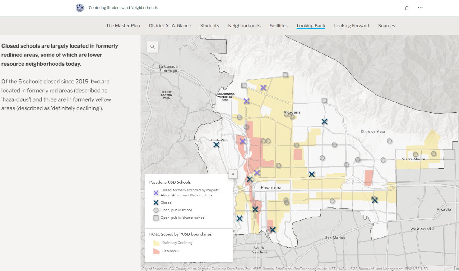
- Storymaps combine interactive maps with multimedia content and text to tell stories about a particular place. We use storymaps – like this one for Pasadena Unified School District – to make the design process visible to our clients and communities.
GIS for equity is rapidly evolving as more verified data sets become available and more interest in the field develops. What won’t change is that informing data selection by directly engaging with communities is a more equitable approach to this technological opportunity.
Continuing a Conversation
Interested in what GIS data sets and tools can do on your project? Here are a few questions you can ask designers to continue the conversation:
- How will you determine which data sets to include in your mapping and analysis?
- How will you use community & social context data to inform recommendations for which amenities would draw the most people to my site?
- How will you use environmental data to prepare the design for long-term resilience in the face of climate change?
- How should we engage the people who will use the space to inform which data is relevant?
Enjoying the Designing for Equity: GIS series? Join us for part three as we reveal real-life educational projects where the outlined approach has achieved equity outcomes, from three K-12 education school districts across the United States to place-based surveys on college campuses.

